

Do you know how to identify and resolve user experience issues on your website?
— With website feedback forms.
These forms seamlessly integrate into your website to gather information, opinions, and comments from users regarding their experiences with the website. These forms are created with the help of a robust website feedback tool that consists of built-in templates.
However, there are different types of website feedback forms. So, which one should you launch and why?
Let’s find it out right here along with its examples.
1. NPS Form
An NPS form measures how likely users are to recommend your website to others. It typically asks a straightforward question:
→ How likely are your users to recommend it to others on a scale from 0 to 10?
Those who give high scores (9-10) are called promoters, while mid-range scorers (7-8) are passives, and low scorers (0-6) are detractors.
But why use this website feedback form?
You should use NPS forms because
- They provide a quick and effective way to assess customer sentiment.
- The score only indicates the current state of user satisfaction and guides for improvement.
By understanding why users do not give a high score, businesses can address specific pain points and enhance the overall user experience.
When to launch this survey?
Place the NPS form on your website or in post-interaction surveys to gather feedback when users are engaged.
So, how can you implement this?
Embed this form on your website or post-interaction surveys. The simplicity of the NPS question ensures high response rates. These resulting scores help you prioritize efforts to create a website that users not only appreciate but also enthusiastically recommend to others.
Brand Example
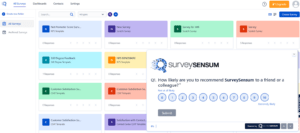 SurveySensum launches NPS surveys on its platform to gauge the loyalty of regular customers who use the tool frequently. By launching NPS surveys, SurveySensum aims to understand how satisfied and loyal its frequent users are, gaining valuable insights to enhance user experience, address potential issues, and build stronger relationships with its user base.
2. CSAT Form
A CSAT form is a type of feedback form that helps businesses understand how satisfied users are with a specific interaction or experience on their website. It usually asks a simple question like
→ “How satisfied are you with your experience?”
Users can choose a rating, often on a scale from 1 to 5 or 1 to 7, with higher numbers indicating higher satisfaction.
But why use this website feedback form?
CSAT forms are like a quick thumbs-up or thumbs-down for a specific aspect of the website. Not just that.
- They’re great for gathering feedback on a recent purchase, a customer support interaction, or any specific feature.
- The scores provide a snapshot of how well that particular aspect is performing, and businesses can use this information to make improvements.
When to launch this survey?
Launch this survey after a specific user interaction.
So, how can you implement this?
To use a CSAT form, businesses typically integrate it into their website or send it out after a specific interaction. Users can easily provide feedback, and the results help businesses identify areas where they excel and areas where they can make things even better. It’s a quick and effective way to gauge customer satisfaction on specific aspects of the website.
Brand Example
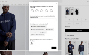 Calvin Klein’s customer satisfaction survey stands out by starting with a general experience question. While this provides useful information, the survey goes further by asking for more details and allowing users to add screenshots. This approach generates actionable insights, making it easier to identify areas for improvement in the customer experience.
3. CES Form
A CES form is a type of feedback form that measures how easy or difficult it is for users to accomplish a task on a website. It usually asks a straightforward question like
→ “How easy was it for you to complete the task you came for?”
Users typically choose a rating on a scale, often ranging from “Very Difficult” to “Very Easy.”
But why use this website feedback form?
You should use CES forms because
- They gauge the website’s user-friendliness.
- They help businesses understand the level of effort users have to put in to achieve their goals.
A lower score suggests users found it challenging, while a higher score indicates a smoother experience.
When to launch this survey?
Launch this survey when a user completes a particular task like a transaction, post-customer support interaction, etc.
So, how can you implement this?
To use a CES form, integrate it into their website or send it after users complete a specific task. The goal is to make the website as user-friendly as possible, ensuring visitors can accomplish what they came for with minimal effort. By collecting and analyzing CES scores, you can pinpoint areas that need improvement and enhance the overall ease of use for your website visitors.
Brand Example
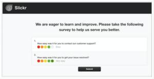 Slickr uses CES surveys to know how easy it is for its users to contact the support and resolve the issue. By launching this survey, they identify areas that need improvement in terms of user experience and take action to streamline processes and enhance overall satisfaction.
4. Product Feedback Form
A product feedback form is a tool on a website that lets users share their thoughts about a specific product or service. It’s like asking,
→ “What do you think about our product?”
Users can provide comments, ratings, or suggestions about their experience with a particular item.
But why use this website feedback form?
You should use this website feedback form because
- They help you understand what users like and dislike about your products.
- Users share what features they love, any issues they’ve encountered, or ideas for improvements.
With this feedback, you can directly connect with your customers and make your products even better.
When to launch this survey?
You should launch this survey when a user buys the product successfully.
So, how can you implement this?
To use a product feedback form, you should include it on the product page or after a purchase. This way, users can easily express their opinions about your products and services. And you can gather valuable insights to enhance your products based on real user experiences.
Brand Example
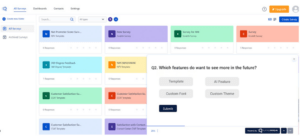 SurveySensum gathers user insights through a product feedback form, asking questions about the platform’s usability, feature effectiveness, and overall satisfaction. By using this form, SurveySensum aims to identify areas for improvement and enhance its offerings based on direct user input. This approach creates a continuous feedback loop, helping the brand stay responsive to user needs and preferences.
Launch Your 1st NPS, CSAT, CES, or Product Surveys
5. ‘Was it Helpful’ Form
A “Was it Helpful” form is a simple feedback tool on a website that asks users whether the information they found was useful. It often appears after users read an article, guide, or any content on the site. Users are usually presented with a question like
→ “Was this information helpful to you?”
and given options to indicate if it was helpful or not.
But why use this website feedback form?
Because this type of form helps
- Website owners understand if their content is meeting users’ needs. If many users say the information was helpful, it signals that the content is valuable.
- On the other hand, if users find it unhelpful, it suggests areas that need improvement.
When to launch this survey?
You should launch this survey at the end of the blogs or articles written on your website.
So, how can you implement this?
To use a “Was it Helpful” form, integrate it at the end of articles or pages. Users can quickly share their feedback, and you can use this information to refine content and ensure it provides the assistance users are looking for. It’s a straightforward way for you to gauge the effectiveness of information.
Brand Example
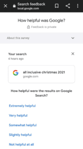
Google often asks if the information in search results was helpful by using a “Was this helpful?” form. After you search for something, Google prompts you to give feedback by clicking a thumbs-up or thumbs-down icon.
This helps Google understand how useful its search results are and improve them based on what users find helpful. It’s a simple way for users to share their thoughts and for Google to enhance the search experience.
6. Subscription Cancellation
A subscription cancellation form allows users to end their subscription or membership to a service. It’s like a digital exit door, where users can communicate their decision to stop using a paid or subscribed service. The form typically asks users why they are canceling and offers options or space for additional comments.
But why use this website feedback form?
This type of form helps you understand
- Why users are choosing to cancel subscriptions.
- Users indicate reasons like cost, lack of use, or dissatisfaction with the service.
- The information gathered is valuable for you to improve your offerings and retain customers in the future.
When to launch this survey?
You should launch this survey when your users are about to leave.
So, how can you implement this?
To use a subscription cancellation form, users typically access it through their account settings or a dedicated cancellation page on the website. The form simplifies the cancellation process for users and provides you with insights into customer churn, helping you make adjustments to enhance your services and possibly retain more subscribers.
Brand Example
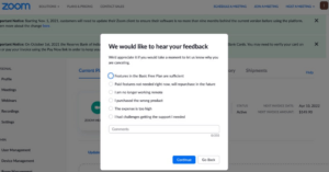
Zoom launched a subscription cancellation survey to understand the reasons behind the customer churn. This survey includes questions about specific aspects that influenced the cancellation and provides an open-ended option for users to share additional comments. By implementing this survey, it gained valuable insights to enhance its services, address user concerns, and potentially improve customer retention strategies in the future.
That was all about the 6 website feedback forms along with brand examples.
Conclusion
To sum it up, feedback forms are crucial for understanding and enhancing website experiences.
- NPS Forms: Measures overall satisfaction and customer loyalty by gauging the likelihood of users recommending the website.
- CSAT Forms: Evaluates user contentment with specific interactions, providing a quick satisfaction rating.
- CES Forms: Assesses the ease of accomplishing tasks on the website, focusing on user effort.
- Product Feedback Forms: Collect insights directly from users about specific products or services, aiding in refinement.
- “Was it Helpful” Forms: Gauges the usefulness of website content, ensuring it meets user needs effectively.
- Subscription Cancellation Forms: Provide valuable insights into why users choose to end subscriptions, facilitating improvements and potential customer retention.
By using these forms collectively, you can gain a comprehensive understanding of user experiences, prioritize improvements, and maintain strong connections with your audience. And to leverage these forms effectively, explore SurveySensum today!


