NPS Dashboard: Find Key NPS Drivers & Insights
Request a Demo
→ Do you have a bird’s eye view of your NPS program?
→ What are your key NPS drivers?
→ Is your NPS data siloed from different teams?
If yes, then you need an advanced, analytical, and intuitive NPS dashboard that gives you this and a lot more.
The better the visualization of your NPS data, the better actionable insights – which you can incorporate into your current and future strategies. It is as important as launching and analyzing your NPS data.
But how do we determine these important factors? Well, let’s scroll and find out. But first, let’s understand what a Net Promoter Score dashboard is and why you need to build an NPS dashboard in the first place.
What is an NPS Dashboard?
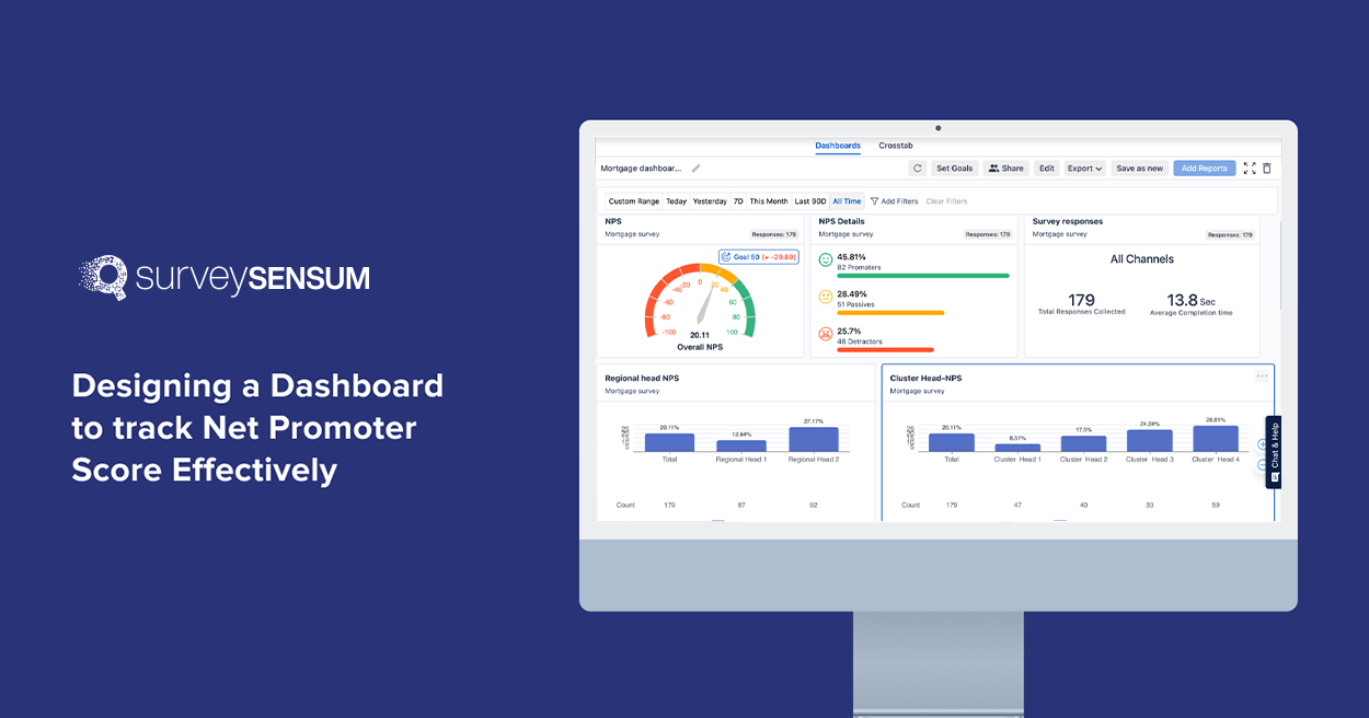
The NPS dashboard is a visual tool that provides you with a bird’s eye view of your NPS program. It gathers key data from NPS surveys, tracks important KPIs relevant to your goals, and helps you analyze and interpret customer loyalty and satisfaction metrics efficiently. An ideal dashboard would present you with an overall NPS score, track NPS trends over time, segment data into categories, identify factors influencing NPS, and compare metrics.
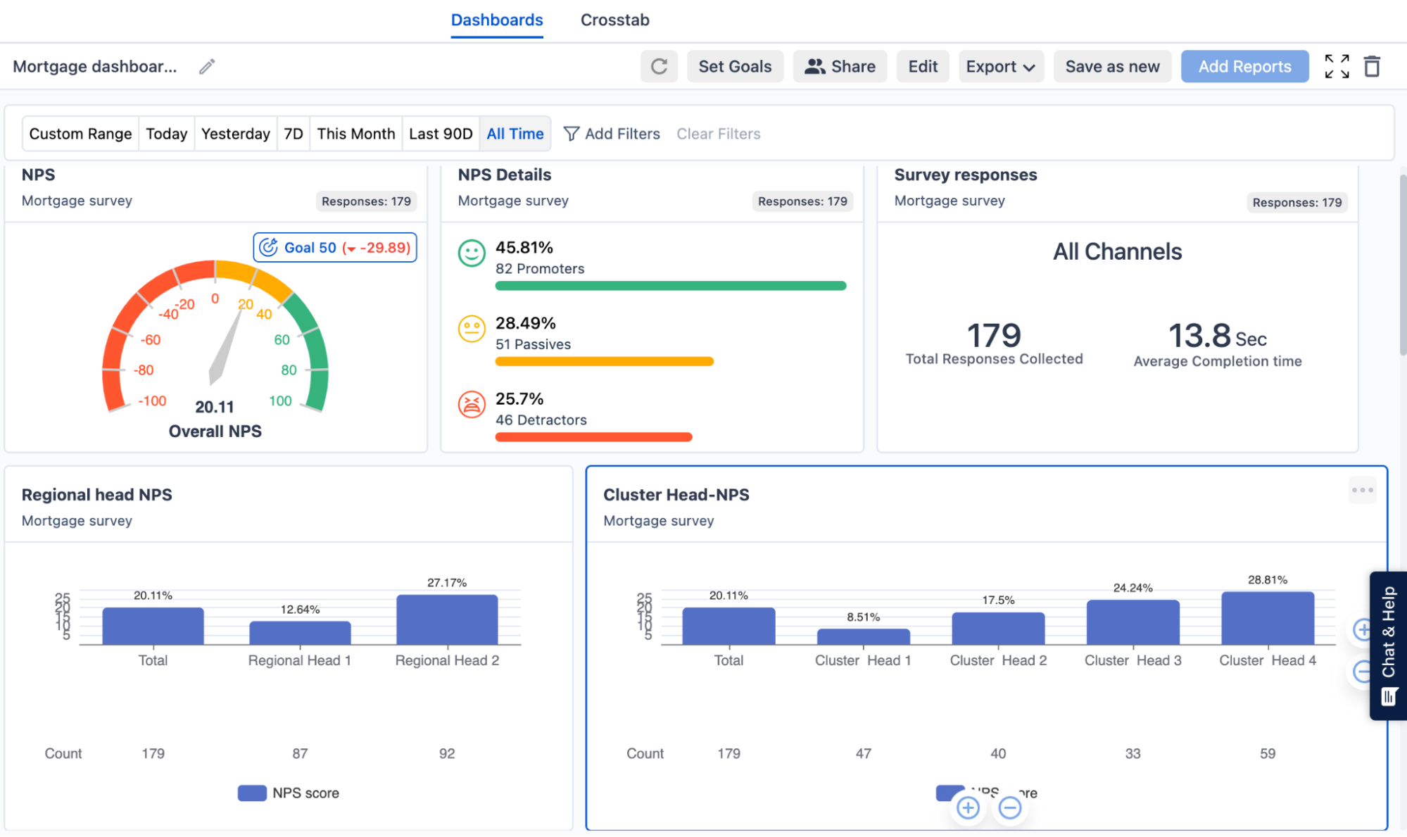
With SurveySensum’s NPS dashboard, you gain a better understanding and visualization of your NPS program. The dashboard includes different elements like overall NPS score, NPS categories, NPS response rate, average completion rate, NPS trends over time, actionable recommendations, NPS benchmarks, etc. You can leverage these insights to drive strategic decisions, take prioritized action, and improve customer satisfaction and loyalty.
But do you really need a Net Promoter Score dashboard? Let’s find out.
Why Build an NPS Dashboard?
Before jumping into designing your NPS dashboard, you need to understand why you need one in the first place because by understanding the “why”, you can determine which data type or widget is important for you.
Here are a few benefits of NPS dashboards.
1. Get a Bird’s Eye View of the NPS Program
With all the NPS data displayed in one place, you can get the full picture of your NPS program all in one place. This will enable you to
- Identify trends in a given period of time
- Compare current NPS data with previous data
- Understand the overall health of your customer relationship
- Gain an overview of how different aspects of your CX program are performing.
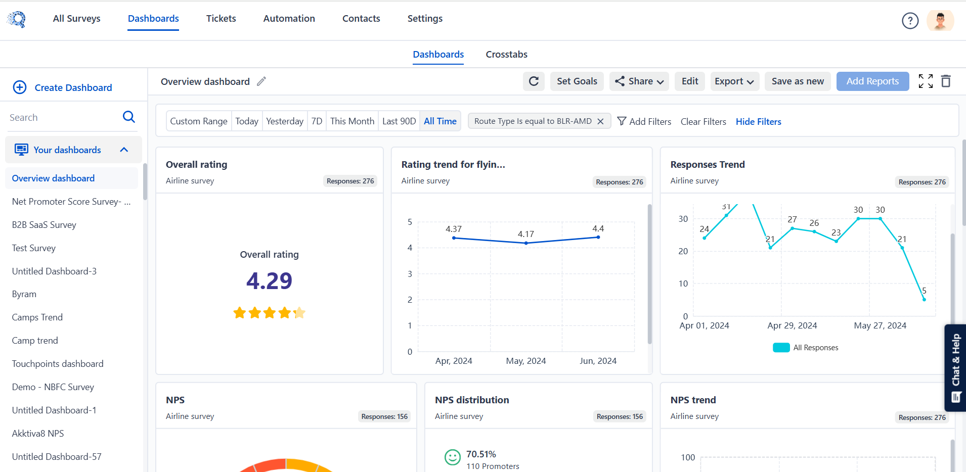
With SurveySensum’s NPS dashboard, you gain an overall view of your NPS program. You can track your overall NPS score, NPS trends over time, average NPS response rate of your survey campaigns, NPS categories, etc. Also, you can tailor the dashboard according to your requirements and which KPIs are important to you.
2. Identify NPS Drivers
You can analyze data to pinpoint what factors are contributing to your high or low NPS score. By identifying these factors you can prioritize your actions based on their impact on your NPS score.
3. Track Progress
You can monitor how your NPS score changes over time. This ongoing tracking is especially helpful when you implement any changes to your NPS program.
4. NPS Trends
You can visualize your customers’ changing sentiments and behaviors over time and by analyzing these trends, you can identify top patterns and predict future behavior.

With SurveySensum’s NPS dashboard, you can track your NPS score trends over time, gaping understanding of trends and patterns in customer loyalty and satisfaction.
5. Share Insights Across Teams
An NPS dashboard centralizes key information about your NPS program in one place which makes it accessible to all relevant team members such as marketing, sales, customer service, etc. When teams are on the same page, they can collaborate effectively using shared data, ensuring everyone is aligned on the goals.
6. Enhanced NPS Analysis
The NPS dashboard consolidates both qualitative and quantitative feedback, making it easier for businesses to uncover recurring themes, pain points, trends, and sentiments. The tool is integrated with advanced analytics tools that provide deeper insights, such as identifying the root causes of customer dissatisfaction or understanding what drives customer loyalty. This detailed analysis enabled businesses to prioritize action and develop targeted strategies.
Measure and track your NPS metrics to boost your customer loyalty with SurveySensum’s NPS software.
Free Forever • No Feature Limitation • No Credit Card Required • Sign Up For Free ![]()
Now, before building an NPS dashboard, let’s discover the key features of an ideal NPS dashboard.
Key Features of a Good NPS Dashboard
NPS dashboard is more than just a NPS data visualization tool. If selected correctly, it can be a powerful NPS software tool designed to enhance your customer experience management process. Now, to leverage its potential there are a few key features that you need to consider while choosing your NPS dashboard.
1. User-friendly Interface
An intuitive and user-friendly interface of the NPS dashboard ensures that all your team members can easily navigate through it and extract key insights. Clear visualizations, such as graphs and heatmaps, combined with straightforward navigation, help users quickly understand customer sentiment without the need for extensive training.
2. Customizable Reporting Metrics
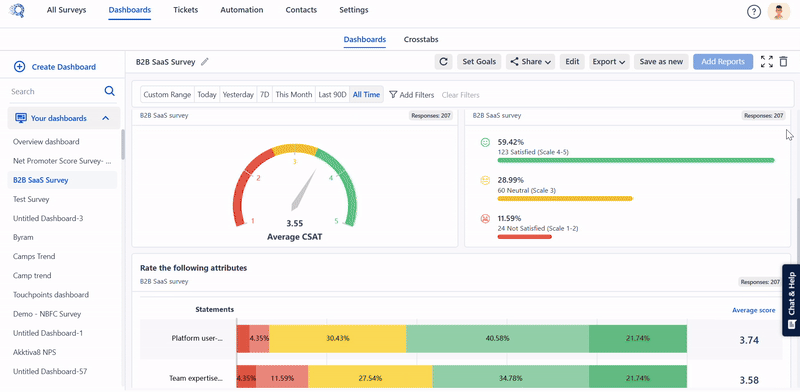
Every business has unique needs and one-size fits all approach never works. So choose an NPS dashboard that allows you to customize your reporting metrics based on specific goals. Whether you want to segment NPS by region, product, or customer type, or track additional KPIs alongside NPS, the ability to tailor reports ensures that your teams can focus on the metrics that matter most to them.
3. Integration With CRM and Other Business Tools
By connecting with platforms like Salesforce, HubSpot, or customer support software, you can create a unified view of customer interactions. This integration enables actions like automated follow-ups with detractors or using promoter data for marketing campaigns, streamlining workflows and boosting productivity.
Integrating NPS tools with HubSpot allows you to sync survey responses automatically, segment promoters, automate follow-ups, and monitor feedback directly inside your CRM.
4. Real-time Analytics and Alerts
Real-time analytics allows you to identify trends as they happen, while automated alerts notify relevant teams of significant changes, such as an increase in negative feedback. This feature ensures that you can respond proactively, minimizing the impact of negative customer experiences and maintaining customer trust.
Now that you have built your dashboard, what data do you need to track?
What NPS Data Should be Included in the Dashboard?
Here are some of the important data that you need to track in your NPS score dashboard.
1. Monthly/Weekly-Wise Net Promoter Score: Track NPS on a monthly, and weekly, wise basis. This will help you monitor how customer sentiment changes over time, identify trends, and assess the impact of changes.
2. NPS Categories: Breaking down your NPS score into its three categories – promoters, passives, and detractors – tells you in which category most of your customers fall.
3. Total Number of Users Who Participated in an NPS Survey: By tracking your participation rate you get an idea of how many customers are taking your survey. A high number of responses indicates relevant data for analysis, while a low number suggests the need to improve survey response rates.
4. Comparison of NPS on Website and App: Analyzing NPS in relation to the time spent on your app or website reveals which medium your customers prefer to share feedback on. This will enable you to optimize your program accordingly.
5. NPS by Customer Segments: Segmenting NPS data by different customer groups (e.g., by region, product, customer type) helps you understand how different segments perceive your brand and enables you to optimize accordingly.
Now that you know what data to track, let’s understand which elements or widgets will provide you with the best visualization.
Which Visualization Elements Should Be Included in the NPS Dashboard?
Here are the key visualization elements to include in your NPS survey dashboard.
1. NPS Performance Gauge
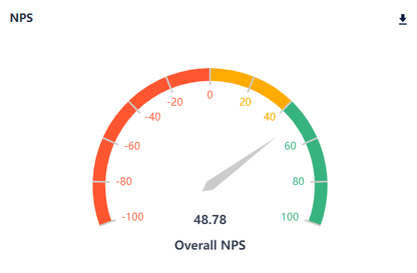
An NPS performance gauge visually represents your current NPS score on a scale using color-coded segments like red, yellow, and green to indicate poor, average, and excellent scores. It provides an at-a-glance view of your overall NPS performance, helping businesses understand how well they are doing in terms of customer satisfaction and loyalty.
2. NPS by Frequency
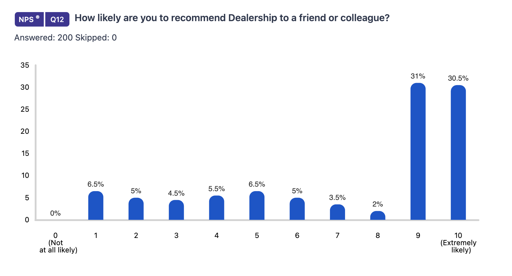
A bar or line chart shows NPS scores over different time intervals. This visualization helps track changes in NPS scores over time, allowing you to identify trends and the impact of improvement in your NPS program.
3. NPS by Tag Analysis
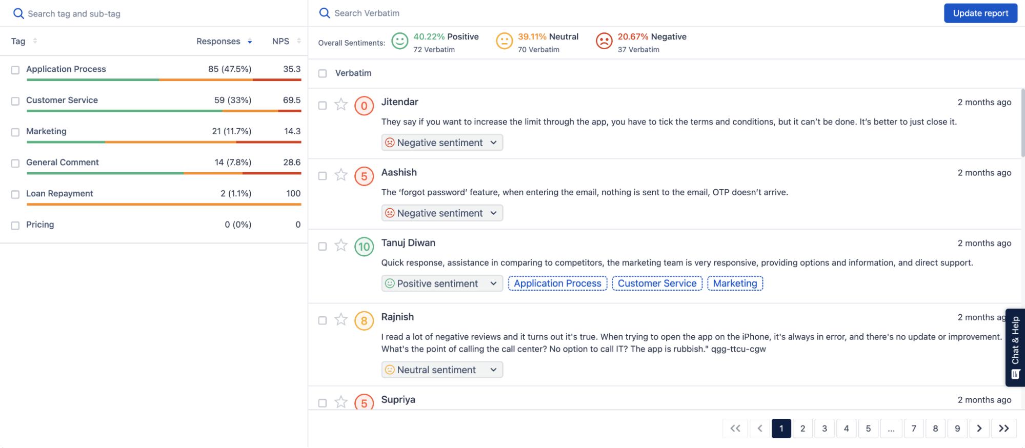
Tag analysis automates the process of segmenting NPS feedback based on keywords or tags (e.g., customer service, product quality, pricing). NPS text analytics help businesses identify the key drivers of NPS scores, identifying top customer complaints, sentiments, trends, and patterns.
4. NPS Historical Data
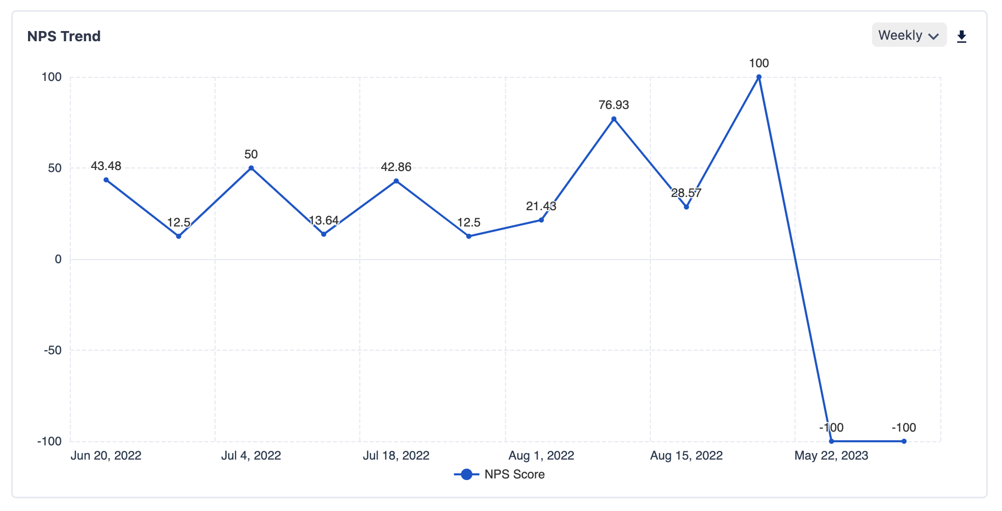
A line chart tracks NPS scores over a longer period, such as year-over-year or quarter-by-quarter. Displaying historical data helps in understanding long-term trends and patterns in customer satisfaction.
5. Word Cloud
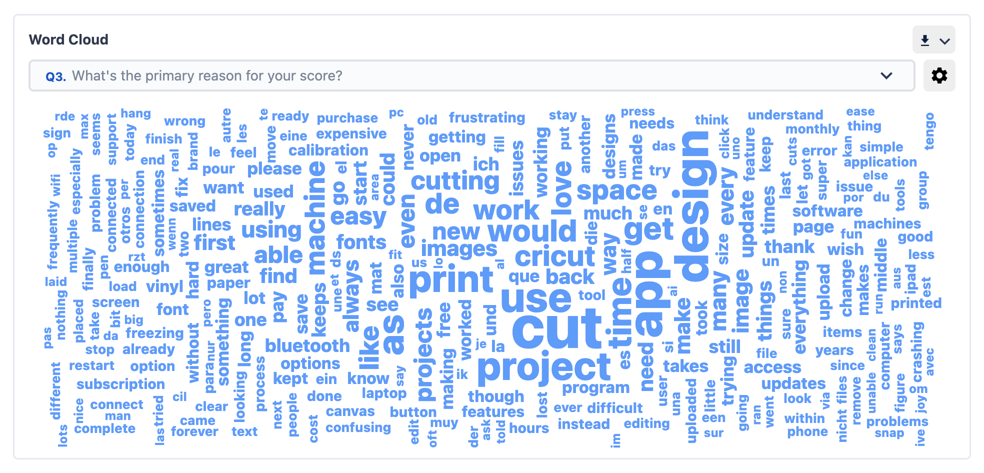
A word cloud visualizes the most common words or phrases found in open-ended feedback, with the frequency of repetition of each word indicating its frequency of occurrence. It highlights the most prominent themes and sentiments expressed by customers.
Track important NPS metrics with SurveySensum’s intuitive, customizable, and analytical dashboard.
Free Forever • No Feature Limitation • No Credit Card Required • Sign Up For Free ![]()
How to Track Customer Loyalty on the NPS Dashboard?
Here is how you can keep track of your NPS metrics with SurveySensum’s NPS dashboard.
Analyze NPS and Get Report In a Single Dashboard
By having all your NPS data in one place, you can easily see overall trends, identify patterns, and understand the general sentiment of your customers. This NPS report provides visualization of NPS data via charts, bars, lines, etc making it simple to interpret without needing to dig through raw numbers manually.
Here’s how you can get this data with SurveySensum’s NPS software:
Step 1: In the SurveySensum’s survey builder, go to the “Report” section.

Step 2: Here you can get a bird’s eye view of your NPS program along with the number of responses received, participation rate, NPS trends, promoters, detractors, etc.

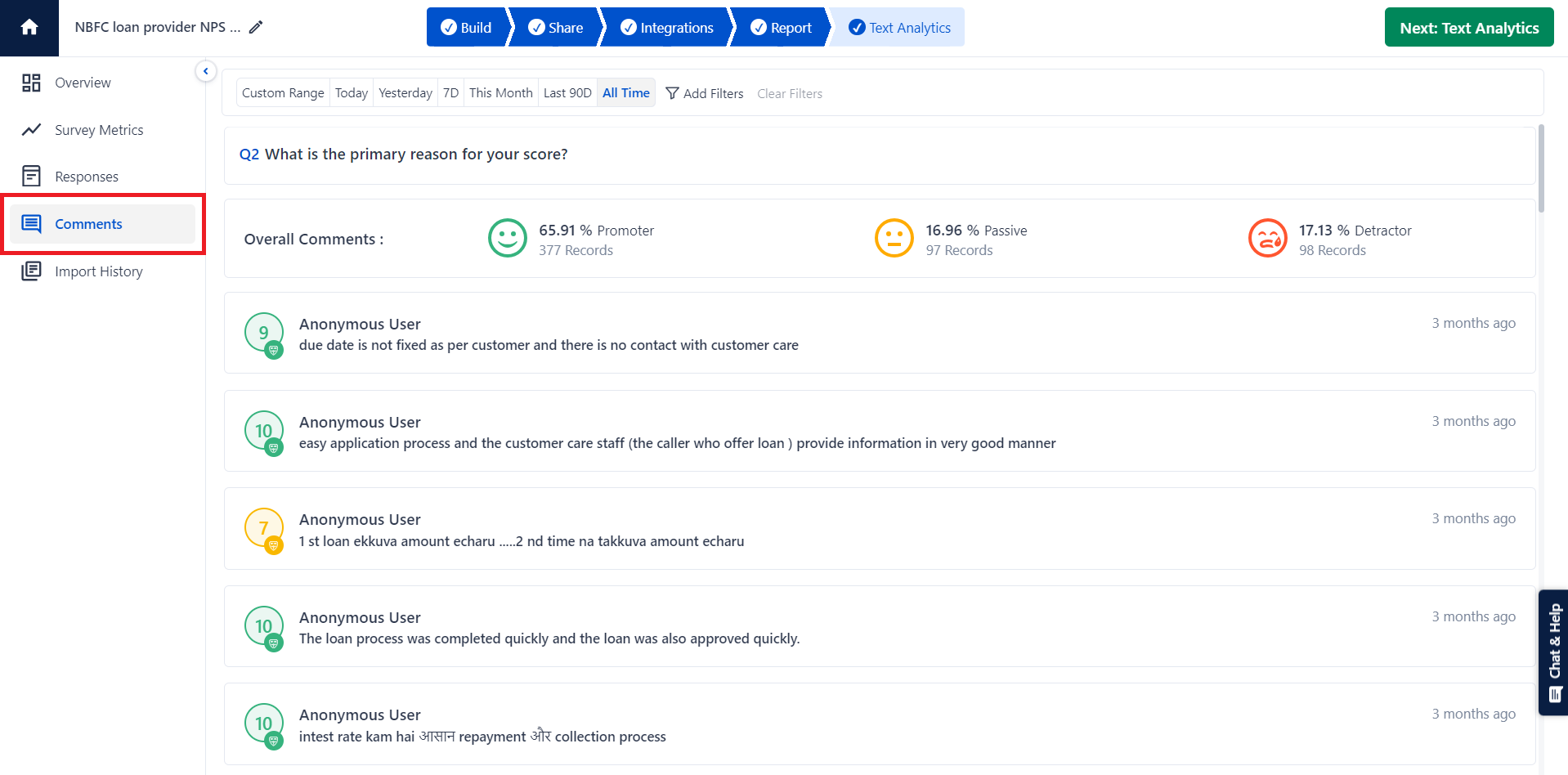
Track Individual NPS Responses
Tracking individual responses helps you pinpoint exactly what customers like or dislike about your product or service. It lets you view each response, see who gave the feedback, and what specific comments they made, giving you a clear picture of individual customer experiences.
Here’s how you can get this data with SurveySensum’s NPS software:
Step 1: In the “Report” tab on SurveySensum’s survey builder, go to the “Comments” section.
Step 2: Here you can see the detailed data on the top trending customer complaints and sentiments.
Compare NPS Data Over Time
By comparing your NPS data over different periods, you can identify trends and measure the impact of changes or initiatives you’ve implemented. It provides you with advanced settings to compare data weekly, quarterly, monthly, and annual basis, helping you understand how customer perceptions evolve and what strategies are working.
Step 1: In the “Report” tab on SurveySensum’s survey builder, scroll down to the “NPS trends” section.
Step 2: Here you can see NPS data over time. You can set the time frame to weekly, quarterly, etc, and visualize the NPS data over time.
Find Key Drivers With the Right NPS Dashboard
An NPS dashboard provides you with a centralized and real-time view of your customer feedback, allowing you to identify trending customer complaints, and sentiments, and keep track of your overall NPS program all in one place. Additionally, it not only enables you to track your customer loyalty but also fosters a culture of continuous improvement in your company.
However, only the best NPS tools can provide you with all that. Tools like SurveySensum, allow you to launch, gather, and analyze NPS data in real time with a robust reporting system. The tool has an intuitive and analytical reporting system that allows you to customize your dashboard according to your NPS goals and get comprehensive insights into your NPS program.
FAQs on the NPS Dashboard
1. What is an NPS dashboard used for?
An NPS dashboard is used to track, analyze, and visualize key metrics and KPIs related to your NPS program. It provides you with a clear and consolidated view of your NPS trends, and scores over time, breaks down data into segments, and helps identify areas of improvement.
2. What tools are best for creating an NPS dashboard?
There are many tools available in the market that are ideal for creating NPS dashboards such as SurveySensum, Qualtrics, SurveyMonkey, etc. Now, if you are looking for a tool that provides all the required advanced capabilities and also fits into your budget then SurveySensum is your best choice.
3. How often should I update my NPS dashboard?
An NPS dashboard should ideally be updated in real-time or at least as frequently as new data becomes available. This ensures that your team has the most up-to-date insights to act upon.
Launch Your NPS Program With SurveySensum
Free Forever • No Feature Limitation • No Credit Card Required • Sign Up For Free ![]()
New to NPS?
List of Features
Looking for NPS Alternative?
Here's the Comparison

Increase ROI by 3x with targeted feedback & analysis
Boost Customer Satisfaction by up to 20%
Reduce Churn by identifying pain points in real time
See it in Action
Contents
How much did you enjoy this article?